When you open a chapter book and spot a fun little drawing at the top of a page, what do you do? You pause. You look at it. You smile. And most likely, you feel something about the story before you even read a word. That’s the power of illustration.
But here’s the thing: not all art styles work for every book. Some make the story feel magical, others make it silly, and some make it feel like a mystery is about to unfold. That’s why picking the right illustration styles for chapter books isn’t just important—it’s part of storytelling itself.
In this blog, we’ll walk through the five styles that really work for chapter books. We’ll show you what each one looks like, when it works best, and how to figure out which style matches your story. Whether you're an author planning your first book or you're working with a book illustration service , this guide will help you choose the style that makes your words come to life.
Chapter books are not picture books, and they’re not big middle-grade novels either. They sit right in the middle, where kids still enjoy visuals but are ready for more words.
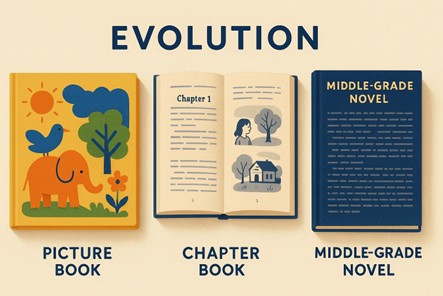
Here’s what makes illustration in chapter books its own thing:
So, if you're planning kids' book illustration for your book, know this: the art should enhance the story, not overshadow it.
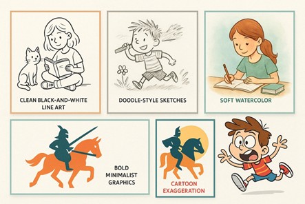
You’ve probably seen this style before in popular series like Junie B. Jones or Magic Tree House. The art is simple: clean black outlines, a bit of shading, and no color. It’s not flashy—it just helps kids picture the story without stealing attention from the words.
Why do so many books use this style? One big reason: clarity.
It’s one of the most reliable illustration styles because it works with almost any genre. Funny story? Check. Mystery? Check. Realistic fiction about a school day gone wrong? Still works.
There’s also a practical reason. Most chapter books are printed in black and white, so this style keeps printing costs down. Just simple, neat art that looks good on the page. Also, it looks so neat on the page.
This kind of art is great if your story:
If you're working with a book illustration service , this is often the first style they'll offer because it's versatile, affordable, and fits most chapter book layouts.
You know that messy, doodle-like art that feels like it could’ve been drawn in the margins of a notebook? That’s this style. It looks playful, casual, even a little chaotic—and that’s the charm.
This style works best for chapter books that are told in a fun or quirky voice. Think Diary of a Wimpy Kid or Dork Diaries. The art matches the voice of the story, which often feels like it’s being told straight from the kid narrator.
What you’ll usually notice:
It’s a great fit for:
If your story feels like something a 9-year-old might secretly draw in their journal, this is your winner.
People who work in this space also have experience as comic book illustrators. So, if your story includes mini comics or visual storytelling breaks, they’ll know exactly what to do.
This one feels soft, gentle, and full of emotion. Light washes of color, soft textures, and smooth blends create an atmosphere that sticks with the reader. Whether painted by hand or created digitally, watercolor gives chapter books a dreamy, heartfelt look.
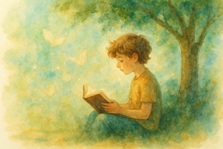
It’s perfect for stories that are heartfelt, dreamy, or full of wonder. If your chapters include magical forests, quiet moments, or meaningful life lessons, this style gives your words the right mood.
What makes it stand out:
It works best when:
Nowadays, many artists do this using digital art styles. That means you still get the same brushy, painted feel—but with easy edits, no smudges, and fewer production issues. It also saves time and can lower costs while keeping that classic, painterly charm.
If you’re working with a book illustration service , ask if they can do digital watercolor.
If your story is fast-paced, full of action, or sharp in tone, this style is a great match. Bold minimalist or graphic art focuses on shapes, space, and clarity. It’s clean and modern. And it keeps the reader’s eyes exactly where you want them—on the story.
Here’s what sets it apart:
This is one of those illustration styles that works incredibly well when your book needs momentum. Think science fiction, adventure, or high-energy plots with lots of scene changes. It’s also a great fit for stories with futuristic settings or digital themes.
You might also like this if:
This is a space where a graphic novel illustrator can really shine. They understand how to keep images clean and punchy without slowing the reader down.
Just remember, minimal doesn’t mean boring. When used right, this style can deliver a ton of energy with just a few lines and colors.
Little spoiler at start: Kids love this one.
It features big heads, silly faces, wild hair, and eyes as wide as dinner plates. It’s loud, it’s colorful (when in color), and it makes characters feel alive even before they say a word.
This style is all about exaggeration. If your book is full of wild situations, silly personalities, or imaginative creatures, cartoon-style art grabs attention and holds it.
Here’s what it usually looks like:
It’s a strong fit for stories that:
This is especially popular in series, where readers come back again and again for the same characters. And if you’re targeting younger readers in that 6–8 age range, this style makes them feel at home. It’s fun. It’s safe. It’s familiar.
Many artists who create this kind of work also double as comic and children's book illustrators , so you’ll have a wide range of talent to choose from. If your goal is to entertain with high energy and bold visuals, this one delivers.
Okay, you’ve seen the options. Now, how do you pick the one that fits your story?
There’s no one-size-fits-all answer. But there are a few questions that can help point you in the right direction.
Most chapter books are written for kids ages 6 to 9. They like pictures, but not ones that feel too childish. Pick a style that helps them stay interested without overwhelming the page.
If your story is slow with emotional moments, go for soft pictures. If it’s fast-paced with lots of action, bold lines, and simple backgrounds work best.
Some illustration styles cost more than others. Watercolor or highly detailed cartooning might require more time, and therefore a bigger budget. If you’re working with a professional service, be upfront about your limits. Most will help you find a style that fits both your story and your wallet.
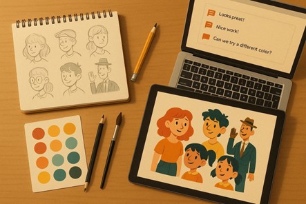
Before locking in a style, ask your illustrator for 1–2 sample scenes based on your manuscript. See how it feels with your words. If something feels off, it’s better to back off early than to redo 15 illustrations later.
Finding the right style is only half the process. The other half? Working smoothly with the person who brings it to life.
Whether you’re hiring a freelance artist or teaming up with professional artists, your collaboration can either be exciting or stressful. However, it depends on how you communicate.
Here’s how to keep things on track from the start:
A great character sketch doesn’t always mean the illustrator is right for chapter books. Make sure they’ve handled book layouts before and understand pacing.
Knowing this initially will save you time and surprises later.
Don’t just say “make it cute.” Instead, be specific: “the character is shy but kind, always hunched over a little.” Share short parts of your manuscript that show tone and feeling so the illustrator knows exactly what you mean.
It’s okay to ask for changes. Just keep it clear and respectful. For example: “Can we make her look a little more nervous here?” is better than “I don’t like it.”
For print, you’ll usually need 300 DPI TIFFs or PNGs. For digital, JPEGs are often fine. If you’re self-publishing, check your printer’s requirements and share them with your illustrator.
Illustrators expect recognition for their work. A simple “Illustrated by [Name]” on the title page or back cover shows respect and professionalism.
This is a question a lot of new authors ask: Should your illustrator work by hand or go fully digital? The short answer? It depends on the look you want and the format you're planning to publish in.
Let’s look at both options.
These are done with real tools—pencil, ink, watercolor, or paint on paper. The result is warm, textured, and full of natural variation. You’ll often find this method in older classics or premium indie books.
Pros:
Cons:
These are created using drawing tablets and software like Procreate, Photoshop, or Illustrator. The best part? Digital art styles can mimic anything from pencil to watercolor, so you don’t lose the handmade “feel.”
Pros:
Cons:
If you’re self-publishing or working with a short timeline, digital is often the best choice. Just be sure your illustrator knows kids’ styles and can keep the art playful and natural.
By now, you’ve seen how different art styles can shape the way a chapter book feels from start to finish. Whether it’s clean black-and-white line art or bold cartoon-style characters, the right visuals help your story land better with young readers.
The truth is, illustration styles aren’t just about what looks nice. They guide emotion, pace, and connection. Each one has its own place, depending on your story’s tone, genre, and reader age.
Don’t forget that illustrations aren’t “extras.” They’re part of the storytelling. When chosen with care, they help kids not just read your book but remember it.
Now it’s your turn to bring your story to life, one word and one image at a time!
Looking for more information? Call us at +1 (855) 521-5040 for quick support!


Have a project in mind? Reach out to us, and we’ll help turn your ideas into stunning illustrations.
Tell us what you need, and we’ll create a custom illustration just for you. Reach out today and let's get started!

Copyright © 2026 360 Illustration House | All rights reserved. Terms And Conditions | Privacy Policy | Refund Policy
